On with it. For those of you that are new and may not be familiar with the ORC, this is my 3rd time participating in the challenge. Linda from Calling It Home hosts this fine event,
If you want to see the starting point, you can do that here. Then you might as well see where I'm going with the space here. In my dreams, we'd add marble subway tile and countertops to the plan. But my dreams have zero budget constraints, and real life most certainly does so counters and backsplash stay. We diiiiiddddd finally decide to go for it on a new fridge! Yesssssssss. No more awkward gap between the fridge and the cabinet above, no more dirty (looking) water and ice dispenser, no more limited capacity side-by-side freezer/fridge situation, and no more sticking out from the counter six inches (which makes a pretty significant difference visually if you're wondering).
We've already gone from this
to this
I mean, leaps and bounds despite the dismal lighting. And check out that brass hardware! Oh haaaayyyyy. I do need to figure out a new solution for the cabinet above...
My mom and I also swapped kitchen rugs, and I'm loving the lighter vibe of the new one so much!
With just a few days to go until the big photo shoot, I'm pretty much in styling territory. I mean, Ava's play kitchen still doesn't have "marble" countertops or a "porcelain" sink (both of which I'm faking with paint), but her brass hardware has been "installed" and looks fabulous against the gray cabinets.
She's going to care about all of this while cooking her felt fruits and veggies, I'm sure.
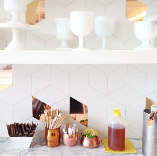
How about some kitchen styling inspiration from a few of my favorites on Instagram?
There's the obvious issue of most of these being white on white on white, but I'll do my darndest.
I'm debating hanging a mirror instead of art on the one empty wall in the space. Maybe one of these?
What's alarming about this situation is that these three mirrors all seemed like necessities when I found them....even though they're so similar. #hoarder. Number two is my top choice because it doesn't seem to compete quite as much with the loads of brass in here. I love the idea of a mirror bouncing light around this space. (And it gives me a place to make sure everything is ship shape before I head out the door.)
I'm still on the hunt for the perfect plant for the new flower pot. It's much larger than I expected, so I will not be putting orchids in it as originally planned. It's also pretty shallow, which is somewhat limiting. I'm up for the challenge! (And open to suggestions.)
Other than that, I'll be getting the adjacent spaces in shape -- namely the porch since it's visible from the eat-in. I've been eager to get the patio together anyway, so no better excuse! We have a busy weekend ahead of us outside of the kitchen prep...fingers crossed I'm able to accomplish everything left on the list in time for the shoot.
See you next week for the big reveal. ox
*See what everyone else is up to here and here.
Because It's Awesome kitchen update is sponsored by but not exclusively furnished by Bellacor. All opinions are expressly my own.


Tidak ada komentar:
Posting Komentar